ClarityVerse - AI Automation Solutions
The brief
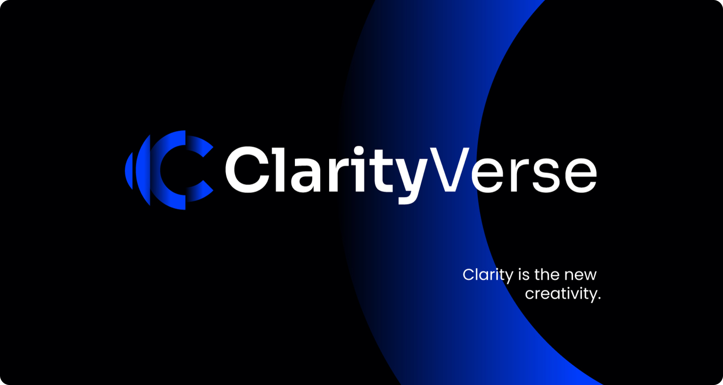
ClarityVerse is a German company that builds AI-powered applications, workflow automation, eCommerce platforms and websites for startups and growing businesses. They asked for a logo and brand identity that feels intelligent, modern and trustworthy.
The challenge
AI and automation brands tend to blur together with the same neon gradients and generic icons. ClarityVerse needed an identity that communicates clarity and technical confidence, and works across a website, product screens and merchandise.
What we did
01 Research
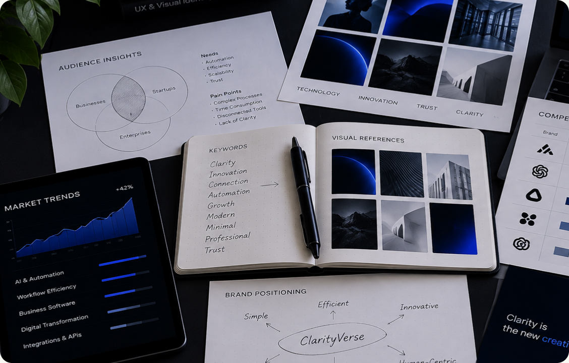
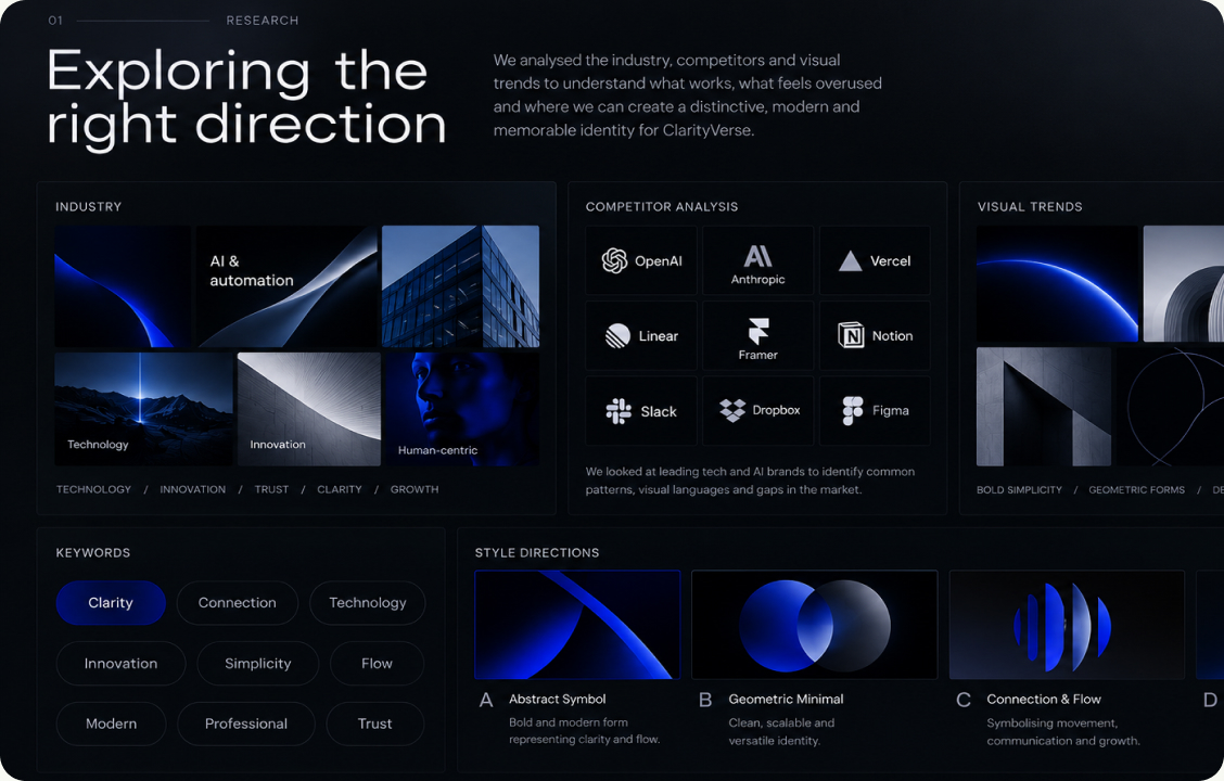
We studied market trends in AI and automation, mapped competitor positioning and defined where ClarityVerse could stand out. The insight was simple: in a noisy market, clarity itself is the differentiator.
02 Direction
We explored visual territories and style directions, from clean and innovative to technical and premium. The chosen direction combines deep dark surfaces with a vivid electric blue to express intelligence, precision and trust.
03 Design
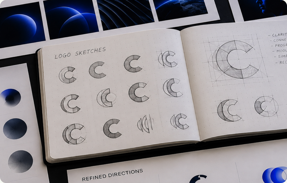
We sketched many variations of the letter C and refined the strongest ones into a bold, abstract symbol built from layered curves. It reads as a lens and an orbit, which fits "clarity" and a "verse" of connected solutions.
04 Build
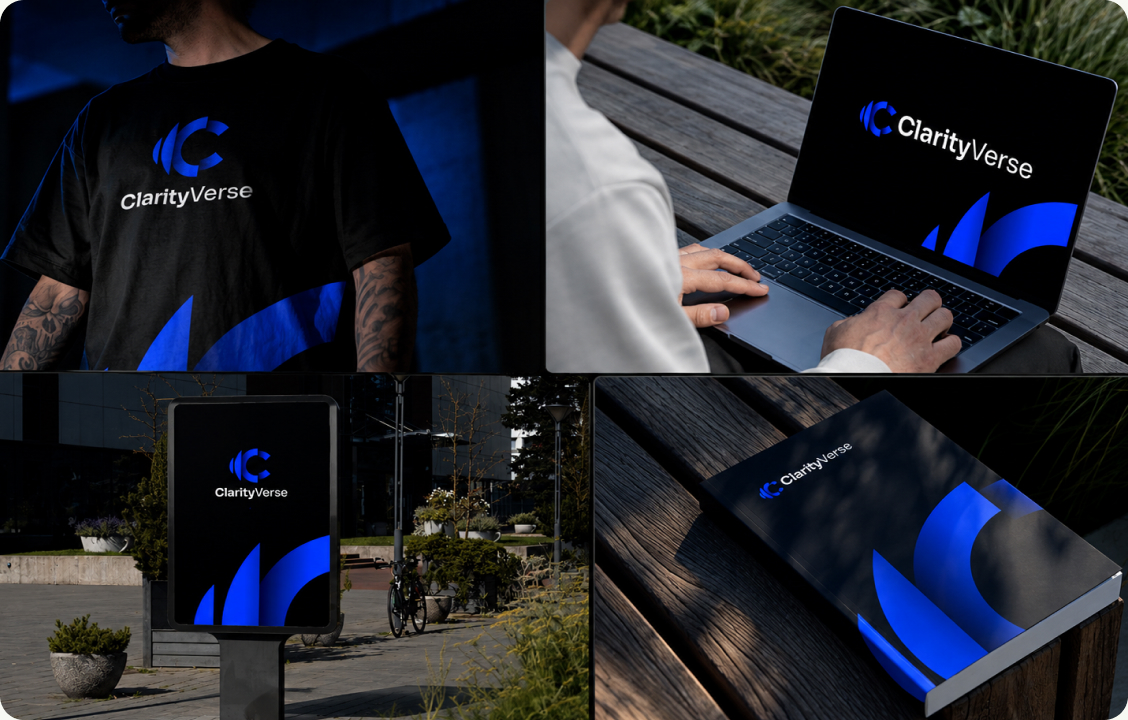
We applied the final identity across apparel, devices, signage and a printed brand book to prove it holds up in digital and physical use. Dark backgrounds with a blue glow keep every touchpoint consistent.
A modern logo shaped through multiple concepts and refinements, built to carry a growing family of products.
Absolutely great work by Bojan. Understood everything on my request. Made me so many propositions and alignments on the logo. Absolutely great and proffesional logo designer. Aligned with modern norms, style and brand design. It's like having a full time agency working with you on the way. Thanks 😊
What was delivered
- Logo files
- Brand guide
- Logo sketches & refinements
- Colour palette with HEX and RGB
- Typography system
- Apparel, device & signage mockups