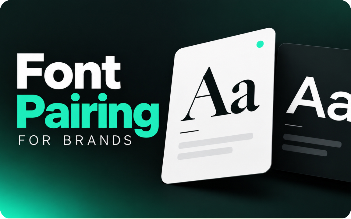
Pair fonts by contrast, not similarity: one display font for headings and one highly readable font for body text, often a serif with a sans serif. Keep it to two fonts, match their proportions, and give each a clear job. Free pairs that work include Playfair Display with Source Sans 3 and DM Serif Display with DM Sans.
Typography does a lot of a brand’s work. The right pair of fonts makes a brand feel consistent everywhere, from the website to a business card. Here are the rules we follow when choosing fonts for client brands, plus combinations you can use for free.
Font pairing rules
- Contrast, not similarity. Two fonts that are almost the same look like a mistake. Combine a distinctive heading font with a calm body font.
- Two fonts is enough. One for headings, one for body text. Use weights and sizes for more variety instead of a third font.
- Match proportions. Fonts with similar x-heights and widths sit well together, even when their style is different.
- Give each font a job. Headings, body, buttons and captions should each have a set style.
- Readability first for body text. Body fonts need open shapes and good spacing at 16 px on a phone.
Easy ways to create contrast
- Serif + sans serif: the classic pairing, for example an elegant serif heading with a clean sans body.
- Display + neutral: a characterful heading font with a simple body font.
- One superfamily: families designed in serif and sans versions, like IBM Plex or DM, pair safely by design.
8 free font pairings that work
| Heading | Body | Feel |
|---|---|---|
| Playfair Display | Source Sans 3 | Elegant, editorial |
| DM Serif Display | DM Sans | Modern, friendly |
| Montserrat | Merriweather | Confident, readable |
| Space Grotesk | Inter | Tech, startup |
| Lora | Inter | Warm, trustworthy |
| Poppins | Lora | Approachable, rounded |
| Fraunces | Work Sans | Distinctive, crafted |
| IBM Plex Serif | IBM Plex Sans | Corporate, systematic |
All of these are available free on Google Fonts and can be used commercially under their open licenses. Check the license of any paid font before you put it in a logo or on a website.
Logo font vs brand fonts
The font in your logo does not have to be one of your website fonts. Logos often use custom or modified lettering. Brand fonts are the ones your team uses every day for headings and text, so they need to be easy to install, licensed for web and available in the weights you need.
Set up your type scale
| Style | Font | Typical web size |
|---|---|---|
| H1 | Heading font | 40 to 64 px |
| H2 | Heading font | 28 to 40 px |
| Body | Body font | 16 to 18 px |
| Small text | Body font | 13 to 14 px |
Write these down in your brand guidelines, with a fallback such as Arial or Georgia for documents and email.
From the studio: test a pairing with real content, not lorem ipsum. A font that looks great in a headline can fall apart in a long paragraph or a price table.
Tools that help
- Google Fonts shows popular pairings on each font page.
- Fontpair collects Google Font combinations.
- Fontjoy generates pairings you can lock and adjust.
Related guides
Our branding packages include logo, colors and a typography system your team can use.
FAQ
How many fonts should a brand use?
Two in most cases: one for headings and one for body text. Use weights and sizes for variety.
What fonts pair well together?
Fonts with clear contrast and similar proportions, such as Playfair Display with Source Sans 3 or DM Serif Display with DM Sans.
Should my logo font match my website font?
Not necessarily. Logos often use custom lettering, while brand fonts need to be practical for everyday text.
Are Google Fonts free for commercial use?
Yes, Google Fonts are released under open licenses that allow commercial use, including on websites and in print.

Founder of SkyDesigner. Fiverr Pro Vetted designer, selling on Fiverr since 2014 with 24,500+ reviews.