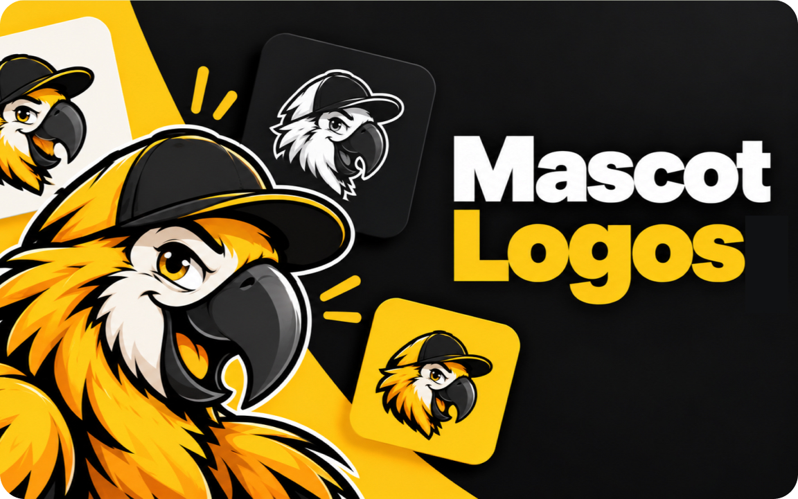
A mascot logo uses a character with a personality as the main brand mark. It works best for consumer brands, apps, food, sports and communities that want to feel friendly and stand out. Design it in vector, keep it to a few colors and always get a simplified version that still reads at favicon size.
A mascot logo uses a character, usually a person, animal or object with a personality, as the main part of a brand mark. Done well, it is the most memorable type of logo there is. Done badly, it is hard to use anywhere smaller than a billboard. This guide covers when a mascot makes sense, the types to choose from and how to make one that still works at favicon size.
What is a mascot logo?
A mascot logo puts a character at the center of the brand. The character can be the whole logo, sit next to the company name, or live alongside a simpler wordmark as a supporting brand asset. What makes it a mascot rather than an icon is personality: it has a face, an expression and a pose that can change from one use to the next.
12 famous mascot logos
| Brand | Mascot | Why it works |
|---|---|---|
| Michelin | Bibendum, the tire man (since 1898) | One of the oldest mascots still in use, built from the product itself |
| KFC | Colonel Sanders | A founder portrait turned into a simple, recognizable illustration |
| Duolingo | Duo the owl | Carries the brand voice in the app, notifications and social media |
| Mailchimp | Freddie the chimp | Gives a software product a friendly face |
| GitHub | The Octocat | Started as a mascot and became the main logo mark |
| Snoo | Simple enough to work as an app icon and be redrawn by the community | |
| Planters | Mr. Peanut | A product turned into a character with a recognizable silhouette |
| Kellogg’s Frosted Flakes | Tony the Tiger | Gives a cereal box energy and a catchphrase |
| Pillsbury | The Doughboy | Friendly, simple and instantly linked to the product |
| Pringles | Mr. P | A face that works as the whole logo on the can |
| Android | The bugdroid | A playful robot that stays readable as a tiny icon |
| Wendy’s | Wendy | A founder-story character drawn as a simple portrait |
These are all registered trademarks of their owners. Use them as inspiration for what works, never as something to copy.
When a mascot logo makes sense
- Consumer brands that want to feel friendly: food, kids, games, pets, apps.
- Crowded markets where every competitor uses a similar abstract mark.
- Brands with a strong voice that will appear on social media, packaging, merch or in an app.
- Sports teams, esports and communities where a character becomes something people rally around.
When to skip it
- Serious B2B, legal, finance and medical brands, where a cartoon can undermine trust.
- Brands that need a tiny, simple mark and have no budget for a second, simplified version.
- When you will not use the character beyond the logo. A mascot pays off when it appears in many places.
Types of mascot logos
| Type | Description | Good for |
|---|---|---|
| Animal | An animal with human traits | Apps, kids brands, sports teams, pet products |
| Human | A person, often a founder or a stylized character | Restaurants, local businesses, personal brands |
| Object | A product or object with a face | Food, consumer products, playful tech |
| Creature | An invented character | Games, communities, tech brands that want to stand out |
How to make a mascot that actually works
- Start with personality, not looks. Write three words the character should feel like, for example "helpful, curious, calm". Every design choice should support them.
- Design for small sizes first. Check the mascot at 32 pixels wide. If you cannot tell what it is, simplify the shapes and reduce details.
- Keep it to a few colors. Two or three colors print cheaply, embroider cleanly and stay readable on any background.
- Plan a simplified version. Most mascot brands need a detailed character for large uses and a head-only or silhouette version for app icons and favicons.
- Make it vector. Draw the mascot in Illustrator or a similar tool so it scales from favicon to banner. See raster vs vector for why this matters.
- Plan poses early. If the mascot will appear in social posts or an app, define a few standard poses and expressions so it stays consistent.
A common mistake: approving a detailed mascot illustration as the logo and only discovering at launch that it turns into a blur as a favicon. Ask for the small version in the same project.
What files you should get
A mascot logo package should include the full character and the simplified mark, each in AI, EPS, SVG, PDF and PNG, in full-color and one-color versions. Our guide to logo file formats explains what each file is for.
Related guides
We draw logos by hand in Illustrator and deliver every file format you need.
FAQ
What is a mascot logo?
A logo built around a character, such as an animal, person or object with a personality, used as the main brand mark or alongside the company name.
Are mascot logos still a good idea?
Yes, for consumer brands, apps, food and communities that want a friendly face. Serious B2B, legal and financial brands usually do better with simpler marks.
Does a mascot logo work at small sizes?
Only if it is designed for it. Most mascot brands use a simplified head-only or silhouette version for app icons and favicons.
Can I base my mascot on a famous one?
Use famous mascots for inspiration only. They are registered trademarks, and a close copy can cause legal problems and confuses customers.
GitHub logos and usage; Michelin. All mascots mentioned are trademarks of their owners.

Founder of SkyDesigner. Fiverr Pro Vetted designer, selling on Fiverr since 2014 with 24,500+ reviews.